| T O P I C R E V I E W |
| tcoolwen |
Posted - 03/09/2009 : 06:38:45 AM
Hi,
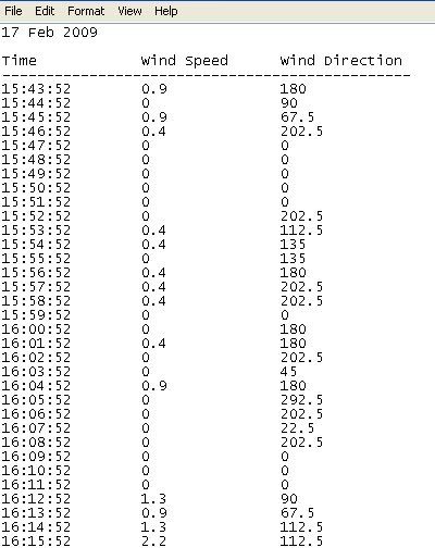
Anyone know how to plot a typical windrose diagram using Origin 8? I'm kind of confuse with the way to input data correctly into the booksheet. Is it that i'l need to rearrange my data(pic 1) so that the windspeed,frequency & wind direction can be shown?
Thank You
pic 1
 |
| 11 L A T E S T R E P L I E S (Newest First) |
| VincentLiu |
Posted - 04/27/2009 : 07:46:51 AM
Dear all,
We have offered a tutorial which shows you how to create the Windrose graph with a menu option (Plot: Specialized: Wind Rose-Binned Data) in Origin 8(SR5). It mainly shows the following things:
1. Create a Windrose graph from binned data.
2. Customzie the direction labels.
3. Merge two Windrose graph.
4. Creaste a Windrose graph from raw data, which just contains direction data and speed data.
For more information, please refer to
http://wiki.originlab.com/~originla/howto/index.php?title=Tutorial:Windrose_Graph
Best regards,
Vincent Liu
OriginLab Technical Services
|
| cpyang |
Posted - 04/25/2009 : 08:46:06 AM
If you update to SR5, we have added a new plot menu called "Windrose from Binned Data" and it should plot correctly immediately by using a template that has all the settings in place. With this template in SR5, you don't even need that Name column as those direction labels are already in the template itself. You might want to put the heading into LongName though, as I am not sure if Comments will get into the legend in this template, but you can also modify that yoursef.
With regard to your post, I suspect it is a matter of choosing polar plot with X=theta. Your plot looks like X = radius.
CP
|
| Old_Trafford |
Posted - 04/25/2009 : 06:10:22 AM
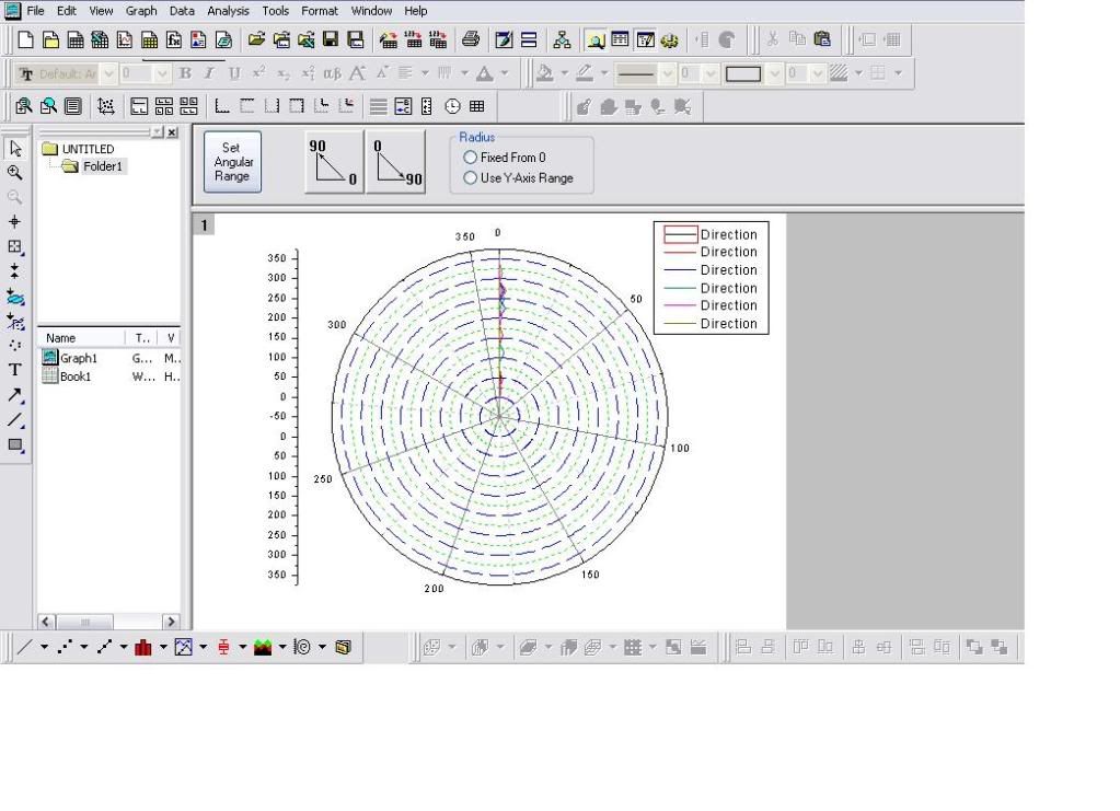
I do all the steps that tcoolwen says and all i get is this graph... what am i doing wrong??
There seems to be a problem with the percentage on the left also...
Thanx in advance
 |
| Old_Trafford |
Posted - 04/25/2009 : 03:59:33 AM
I seem to be having problem to make the percentage in the Y axis on the left. Also, i am not getting a proper graph. Would it be easy to send me the template for that, please? |
| tcoolwen |
Posted - 03/18/2009 : 05:02:30 AM
Hi Guys,
Thanks for all ur help.Finally,I managed to plot the windrose diagram.I've listed out my procedure in details here so that in future,if any user faces the same problem again.
Regards,
Kent
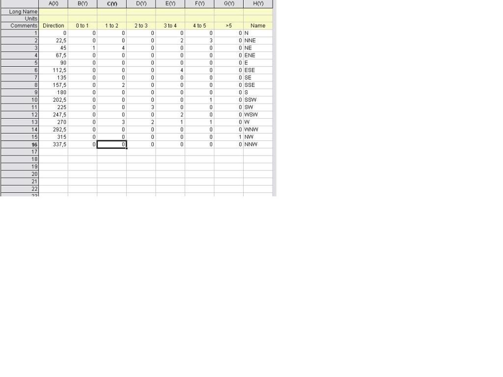
THE PROCEDURE
then input the A(X), B(Y) till G(Y),
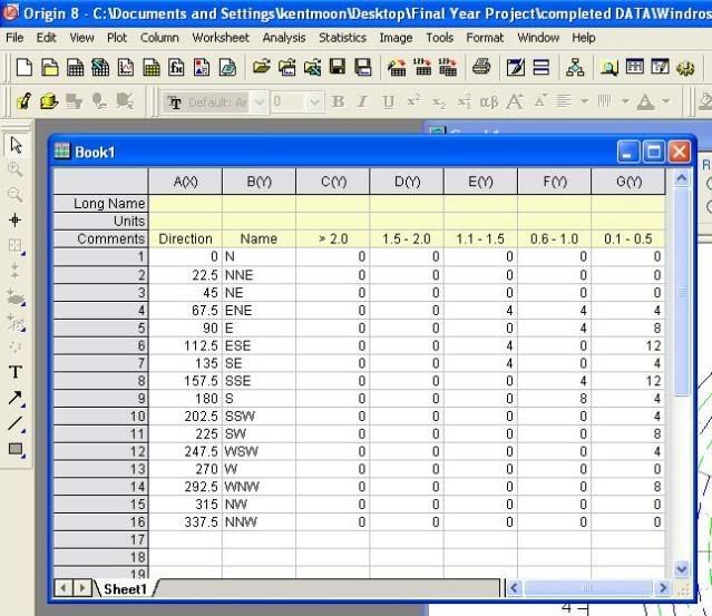
click plot ->specialized ->theta(X)r(Y)
click add,ok.
theta & r are ticked as follow
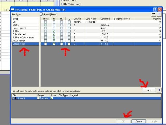
the windrose is then generated.
click set my angular range to change the increment to 22.5,ok.
right click on the degree of angle ->Tick Labels
change type to Tick-indexed datas,choose [Book1]Sheet1!B for dataset,ok
***[Book1]Sheet1!B represents column B(Y)
at the bottom right of the window,select stack column.
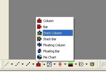
the windrose will then converted into this form.
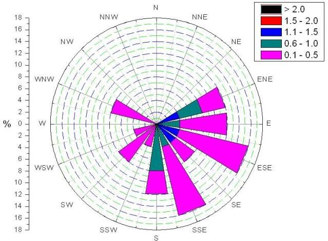
|
| snowli |
Posted - 03/13/2009 : 5:33:26 PM
Hello,
Here is the image Greg mentioned above.

Thanks, Snow Li
OriginLab Corp. |
| greg |
Posted - 03/13/2009 : 5:27:18 PM
You will have to decide how to handle duplicate entries. The options in the new 2D Binning will include Count, Sum, Mean, Median, Minimum, Maximum and Relative Frequency.
Here is your data plotted using the Mean setting... |
| tcoolwen |
Posted - 03/12/2009 : 7:02:07 PM
hi cpyang,
Thanks for the info.I'l keep my eye on it.
kent |
| tcoolwen |
Posted - 03/12/2009 : 6:59:54 PM
Hi Deanne,
Thanks for the guide,but that's not the what i'm looking in for.
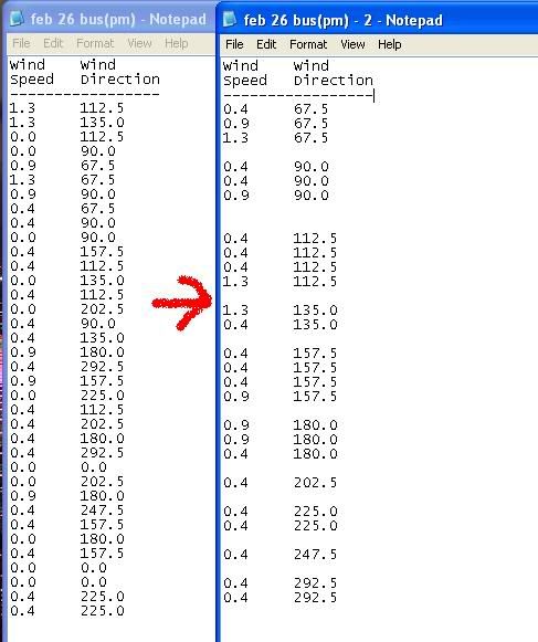
I'm facing trouble of arranging my data in the appropriate form (as in your second link) so that it can generate a windrose. At 180 degree,there are 2 different wind speed recorded.So how am i suppose to do it?Thank You
Sorry for all the trouble guys,i'm still a newbie |
| cpyang |
Posted - 03/10/2009 : 09:03:45 AM
We have a new service release (SR5) coming up and we will add the ability to our 2D frequency count to provide option to produce Average so that your data can be easily binned to the form for making Windrose plot.
CP
|
| Deanna |
Posted - 03/09/2009 : 10:58:15 PM
Hi,
I think you can import such data using Origin's Import ASCII tool or the Import Wizard.
Here is a short tutorial on how to use the Import Wizard:
http://www.originlab.com/www/helponline/Origin8/en/mergedProjects/Tutorial/Tutorial/Import_Wizard.html
We also have an article on how to create windrose plot:
http://www.originlab.com/www/support/resultstech.aspx?ID=1042&language=English&Version=All
But the data seems to be different from yours. You mentioned you want the graph to show "frequency". What does that mean?
Deanna
OriginLab Technical Services |