quote:
Originally posted by fr0zensphere
Origin Ver. : OriginPro 2016 (64-bit)
Operating System: Win 10 (64-bit)
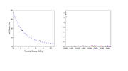
My question is, why do my plots have different thickness of the axis and tick marks, even though I set it to the same value in the settings? I made different plots in separate Origin files. When I right click on the axis and go to Properties -> Line & Ticks -> Under the "Line" section I selected thickness of 1.5 for both. However, when I put these plots side by side in a PowerPoint slide, for example, they clearly look different in the thickness of the axis lines and ticks.
Here's an image I made from pasting them in PowerPoint and exporting. I blocked out most of the right graph because it's unpublished research and could be sensitive. But you can see that they don't look the same. Why is that? Is it because of variation in the plot dimensions?
Here's a link to the image:
https://i.postimg.cc/bNLvsBSz/plot-comparison.png
In Plot Details - Layer Properties dialog, set Fixed Factor = 1 in Display tab.
░░▄▀░░░░░░░░░░░░░░░▀▀▄▄░░░░░
░░▄▀░░░░░░░░░░░░░░░░░░░░▀▄░░░
░▄▀░░░░░░░░░░░░░░░░░░░░░░░█░░
░█░░░░░░░░░░░░░░░░░░░░░░░░░█░
▐░░░░░░░░░░░░░░░░░░░░░░░░░░░█
█░░░░▀▀▄▄▄▄░░░▄▌░░░░░░░░░░░░▐
▌░░░░░▌░░▀▀█▀▀░░░▄▄░░░░░░░▌░▐
▌░░░░░░▀▀▀▀░░░░░░▌░▀██▄▄▄▀░░▐
▌░░░░░░░░░░░░░░░░░▀▄▄▄▄▀░░░▄▌
▐░░░░▐░░░░░░░░░░░░░░░░░░░░▄▀░
░█░░░▌░░▌▀▀▀▄▄▄▄░░░░░░░░░▄▀░░
░░█░░▀░░░░░░░░░░▀▌░░▌░░░█░░░░
░░░▀▄░░░░░░░░░░░░░▄▀░░▄▀░░░░░
░░░░░▀▄▄▄░░░░░░░░░▄▄▀▀░░░░░░░
░░░░░░░░▐▌▀▀▀▀▀▀▀▀░░░░░░░░░░░
░░░░░░░░█░░░░░░░░░░░░░░░░░░░░
░░╔═╗╔═╗╔═╗░░░░░║░║╔═╗║░║░░░░
░░╠═╣╠╦╝╠╣░░░░░░╚╦╝║░║║░║░░░░
░░║░║║╚═╚═╝░░░░░░║░╚═╝╚═╝░░░░
║╔═░╦░╦═╗╦═╗╦╔╗║╔═╗░░╔╦╗╔═╗╔╗
╠╩╗░║░║░║║░║║║║║║═╗░░║║║╠╣░╔╝
║░╚░╩░╩═╝╩═╝╩║╚╝╚═╝░░║║║╚═╝▄░